Help Files
Charts
| Mobile > Charts |
The Chart component displays a graphical representation of time series data and technical studies. A chart can contain up to 4 symbols in a single graph. The user can also choose between 3 different chart types line, bar, and candlestick chart.
Change the interval by selecting one of the icons across the top of the graph.

Use the + icon from the toolbar above the chart to add an additional symbol to the chart.

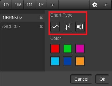
Use the settings icon to change the chart type.
![]()
The following window will appear and you can chose between line, bar, and candlestick chart.
 |
Line Chart |
 |
Bar Chart |
 |
CandleStick Chart |
Use the settings icon to change the chart color.
![]()
The following window will appear.
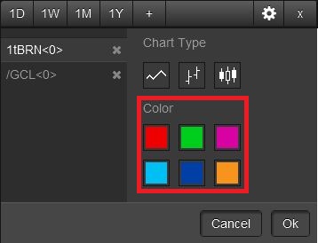
Select the symbol on the left so that it is highlighted then select a color and click ok.
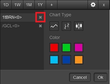
To remove a symbol from a chart use the settings icon.
![]()
Each symbol from the chart will show up in the window. Click on the X next to a symbol to remove it from the chart.